The accounts area of Zesty.io is where you manage and create new web properties. In this new release, the user interface design has gotten an update, along with the flow of how you create a new web property.
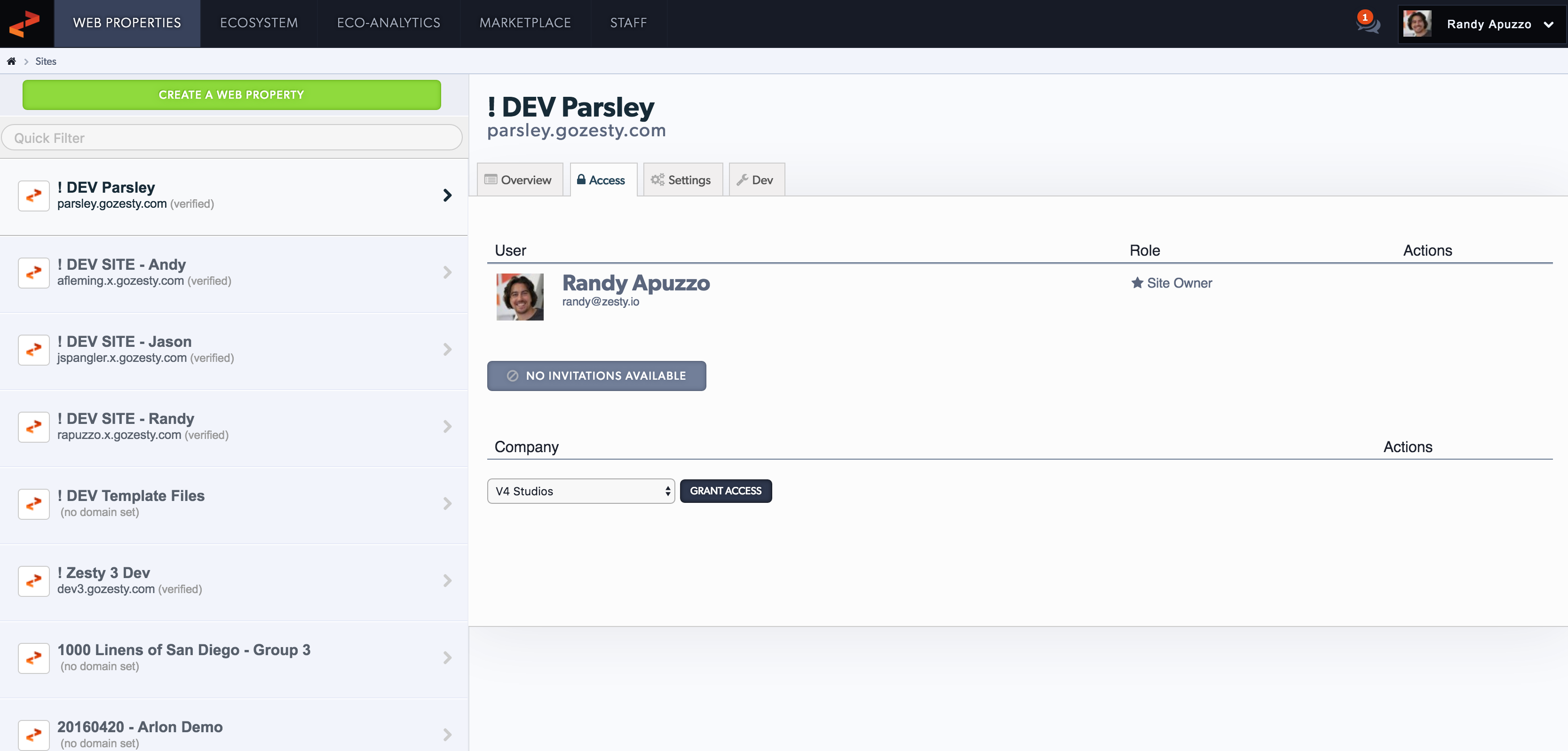
A screenshot of the OLD accounts design:

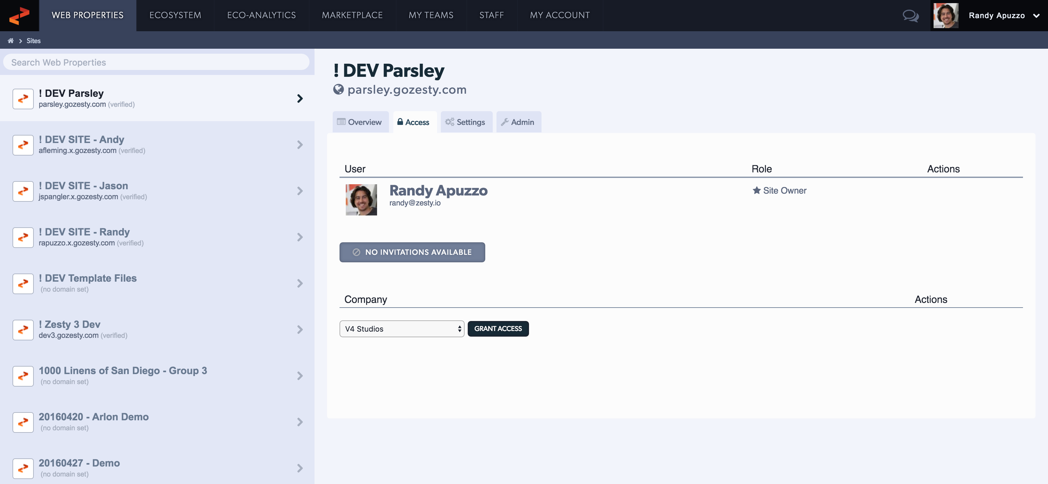
A screenshot of the new accounts design:

What is the Difference?
Subtle changes in design. We removed a lot of the feel accounts has maintained since the early 2011s, most of which was a heavy usage of borders and text-shadows. Along with the design update, we improved usability of accessing information. A "my account" tab is now present, and language between sections has been made consistent. Before "my account" was only accessible through the user dropdown.
Building a new creation flow
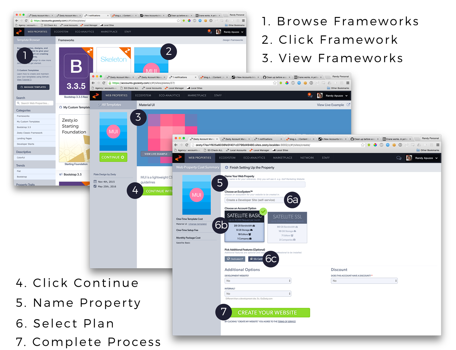
After getting feedback from developers in the community, we listened, and made some changes to simplify the process. The original process was a combination of three views that had this steps:
- Click a create web property button
- Browse a screen of design frameworks
- Click into a design framework single page
- Confirm the design framework
- Name your web property
- Select a plan for your web property
- Complete the process
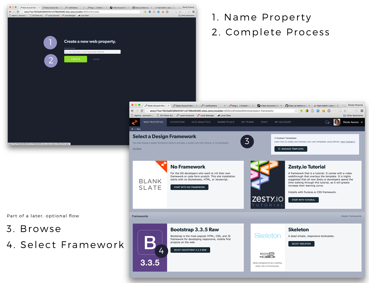
The new process is one view, that has less steps:
- Click create web property button
- Name your web property
- Click Create
A user, of any type, can now work in a non-linear process. They can then select a design framework (in a single screen), and start building OR invite team members to their new web property OR select a plan. By extrapolating the original process into multiple simple processes, the flow became friendly to all user types (developers, content managers, or marketers) . A developer would want to select a framework and get coding, a content manager would want to start inviting their team, or a marketer would select the plan and invite their content manager. Let's take a look at the design process.
The original process was a series of three screens, that had 7ish steps.

All the steps of the old process created many opportunities for confusion, especially for a new user. We hit the whiteboard and abstracted out of the processes and boiled it down to 2 definitive steps.

The steps we removed are now part of new interfaces that trigger when it is relevant to make those decisions. Step 3 and 4 above are part of a developer interface that trigger when they start building the web property for the first time. Plan and options are now part of an interface that is triggered when an account manager wants to invite more users to the web property, or send the web property live on a domain.
If you have any feedback, let us know on our community Slack channel at https://zestydevs.slack.com or at https://forum.zesty.io

